Professional cycling is a tough sport, of that there is no doubt, but it’s also very pretty.
Think of the Tour de France, with some of the worlds fittest athletes dancing gracefully on the pedals; beautiful mountainous backdrops; fields full of sunflowers; cutting edge bikes; and the colour and movement of the peloton as it glides through some impossibly picturesque French village.
This is the way I like it.
When watching the sport from the comfort of your settee, if the racing itself is in something of a lull it’s the pretty bits that catch your attention, which is why I’m so alarmed about a number of recent blots on the landscape of our viewing pleasure.
I fear it may be time to take the draconian step of introducing minimum acceptable aesthetic standards to pro-cycling.
Let’s examine the evidence:
Kinesio tape
Depending on your level of interest in cycling, and sport in general, when you hear the phrase ‘Kinesio tape’ you will either be rubbing your chin and nodding sagely, or thinking to yourself, ‘eh, what…never heard of it’.
For the uninitiated, Kinesio tape is exactly that – tape. It’s usually bright blue, and can be seen stuck in great strategically placed strips to the body of an increasing number of athletes with the aim of preventing or controlling injury. In cycling we see it plastered up and down their thighs, across knee joints, or peeking out of their jersey’s in aid of some long forgotten shoulder injury.
As this well written article by Cycling Weekly suggests, evidence of the actual benefits to performance or injury reduction seem to be sketchy, with the benefits apparently restricted to short term pain relief to injured areas at best.
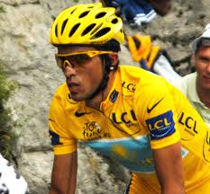
There are some cyclists who appear to be held together by the stuff, and we’re not just talking about the also-rans; Tony Martin, Alberto Contador, I’m looking at you (although to be fair, Contador has recently broken a leg), but still…it doesn’t look pretty.
Nose tape
Nose tape (if that’s what it’s called; it may well have some fancy scientific name, but if I get into googling this stuff I’m just playing into their hands) is basically the same issue as Kinesio tape.
As pointed out by Chris Boardman on ITV4’s coverage of the Tour de France here in the UK (a man who gives me the impression that he generally knows what he’s talking about), these unsightly strips across the bridge of the nose serve no purpose; they simply give the impression that the wearer was on the wrong end of a knuckle sandwich after a late night in some back-street bar.
If a cyclist should choose to take the start line looking like they are held together with Kinesio tape, and with a stretch of nose tape across their conk…
…frankly, I don’t care if your name is Tony Martin.
Skinny climbers and their white, muscle free torsos
Some of the legendary figures of the sport over the years – Charly Gaul, Federico Bahamontes, Lucien van Impe – and some of the modern greats too – Nairo Quintana, Alberto Contador – possess the stick thin upper body of the true climber.
As my wife accurately (and hilariously) describes them; they are the ‘pipsqueaks’ of pro-cycling.
I have no problem with this – to ride well in the mountains, the upper body of a badly drawn stick figure makes perfect sense. What I have a problem with is these riders displaying this lack of upper body, often alarmingly white and translucent, to the watching world on crossing the finish line.
The correct etiquette on winning a stage is to zip your jersey up before the finish line to display the sponsors logo’s for the cameras, but also to remove from display your slightly weird looking physique.
Rafal Majka’s win on stage 14 of the 2014 Tour de France at Risoul was impressive, no doubt, but the sight of his pale, sweaty, hairy chest – essentially nothing more than some skin stretched over a bony ribcage – quite frankly put me off my dinner.
This is not a good look. Zip up please lads.
POC helmets
Team Garmin Sharp are never shy of expressing themselves through their kit design. For many years their blue, white, and orange argyle kit design was the last word in love it/hate it divisive styling; they clearly embrace the pro-peloton as sporting catwalk. In many ways, they should be commended for their recent bold attempt to introduce an element of style into the world of helmet design.
I have made my thoughts clear on the dreaded cycling helmet already. For my money, the helmet is a very necessary but ultimately tedious piece of kit that is seemingly immune to all attempts to make it desirable or pleasing to the eye. While I appreciate the attempts by David Millar and his team-mates to elevate the humble helmet, I believe the bar is best kept low in this regard; simply aim to avoid looking like a mushroom head, and leave it at that.
Unfortunately, with their innovatively sculpted POC helmets they give the appearance of the ultimate mushroom heads – the Grand Champignon’s of the pro-peloton – and no amount of strut and swagger can get you away from that.
Astana kit
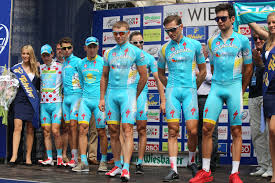
The problem is the colour, mainly.
I’ve heard it described as ‘baby blue’, which is probably about right. Apt, too, as any member of the Astana team kitted out in full winter garb – winter jacket, full-length tights, gloves, overshoes – looks remarkably similar to an overgrown baby in an ill-fitting romper suit.
Come on Astana; now that you have the Tour de France winner in your ranks, why not provide him with some kit worthy of his status?
****************
Perhaps you think that an attempt to police this stuff is over the top, and impossible to enforce?
You may have a point, but can I draw your attention to some of the abominations that masqueraded for team kit in the 1990’s.
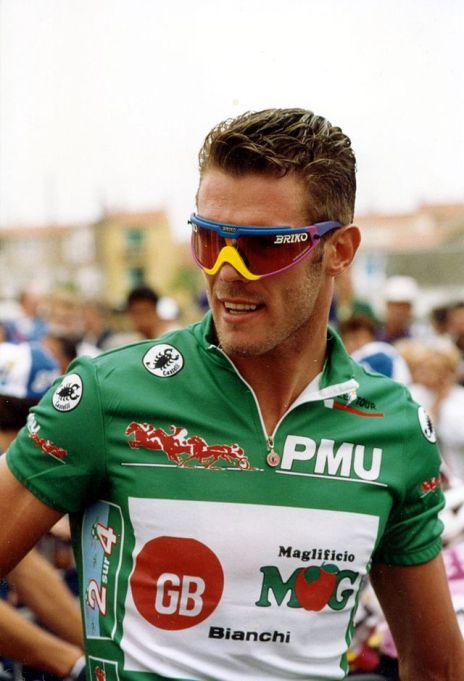
Perhaps some out there have a certain fondness for the oversized 90’s sunglasses sported by Mario Cipollini and his like…
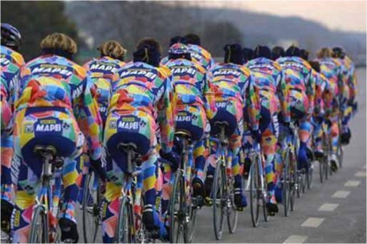
Or maybe you have forgotten just how bad the legendary Mapei kit could get…
If we don’t step in now, we could end up in the bad old days.
Is that what you want?


